-
![]()
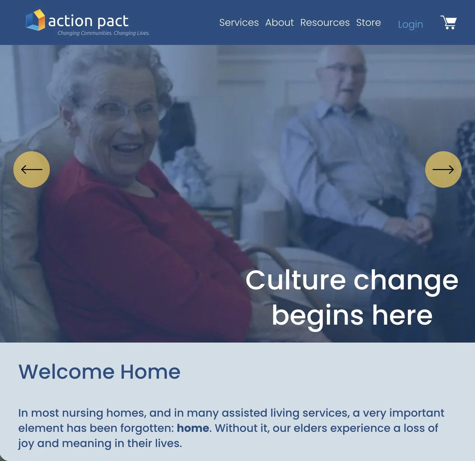
Original Design
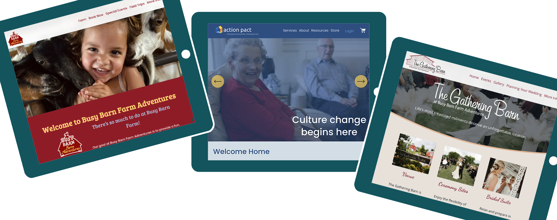
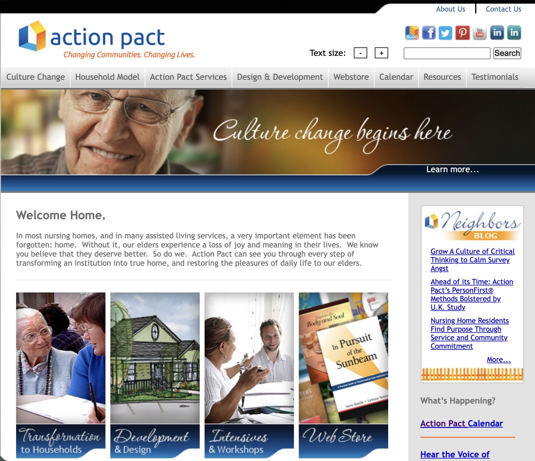
The main concerns for redesigning this site were to make it responsive, device friendly and simplify navigation.
-
![]()
New Design
This site has A LOT of information. The new home page was designed to give a bit of information about the company and its services without being overwhelming.
-
![]()
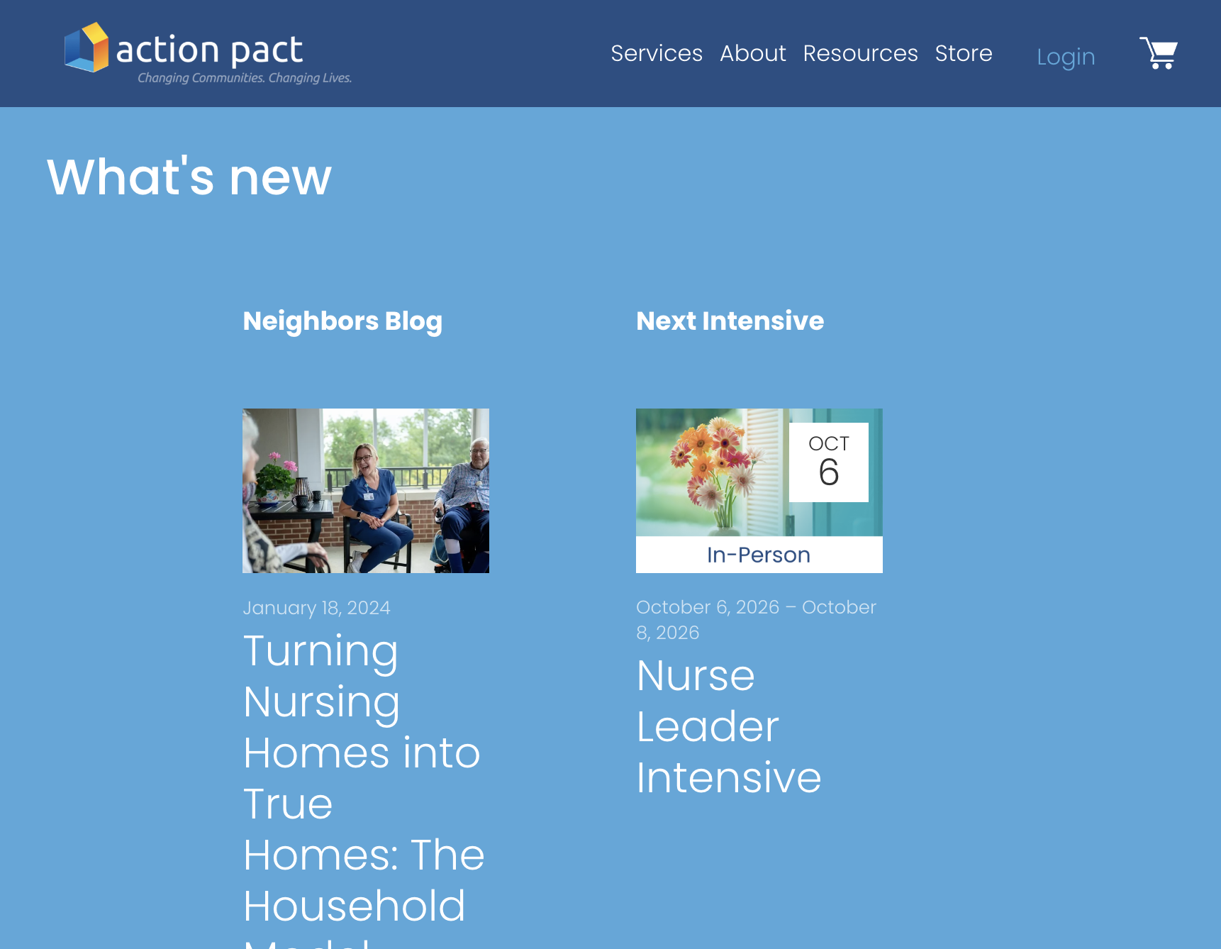
What's New?
The home page has easy access to new content and offerings, which can also be found on their main pages with additional information.
-
![]()
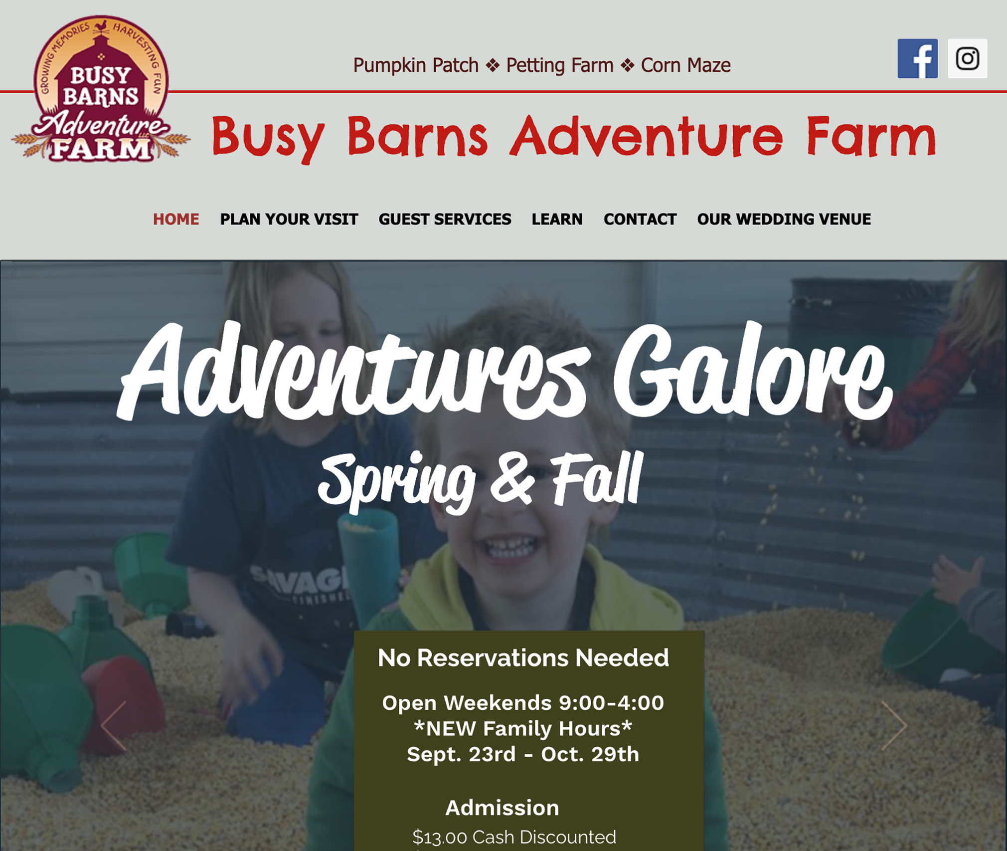
Original Design
This site needed a fresh, modern redesign to usher in the new owners of a agritourism farm business.
-
![]()
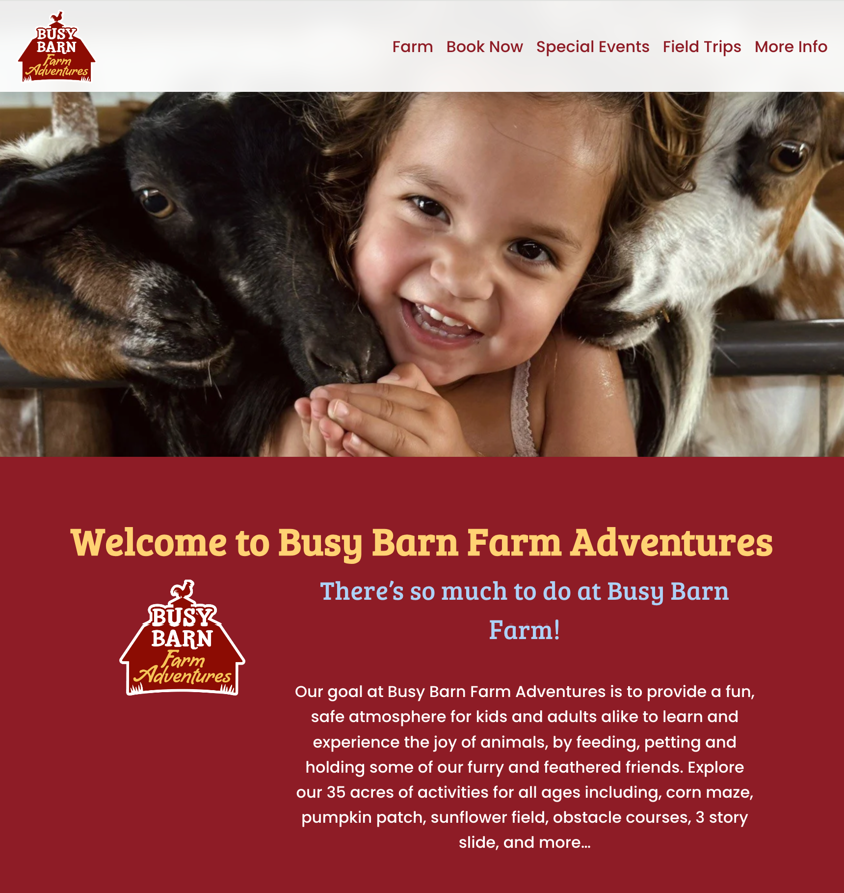
New Design
Bright, fun colors were used to appeal to kids and reflect the essence of the farm and land.
-
![]()
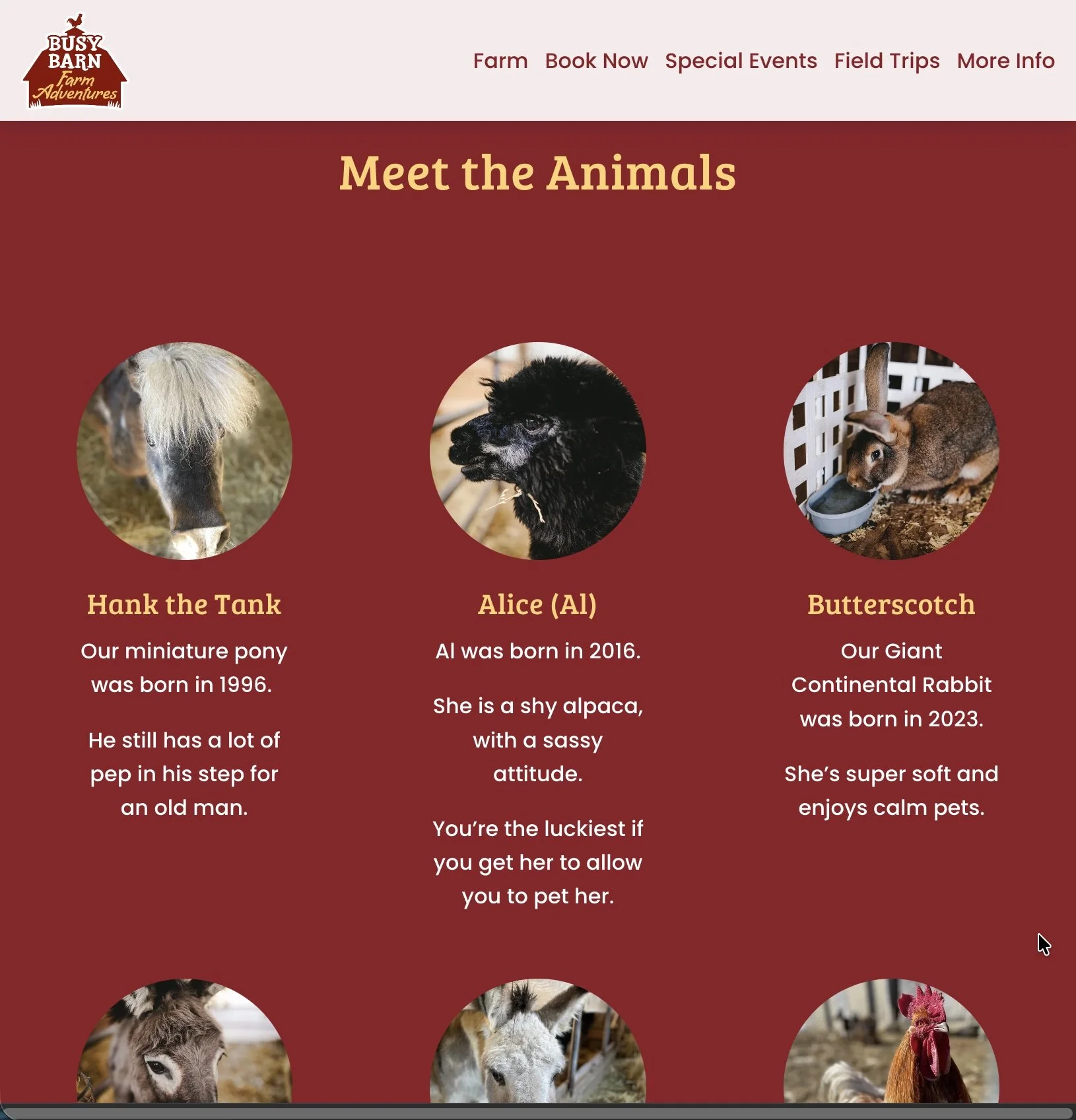
Meet the Animals
Fun pages were added to inform and delight.
-
![]()
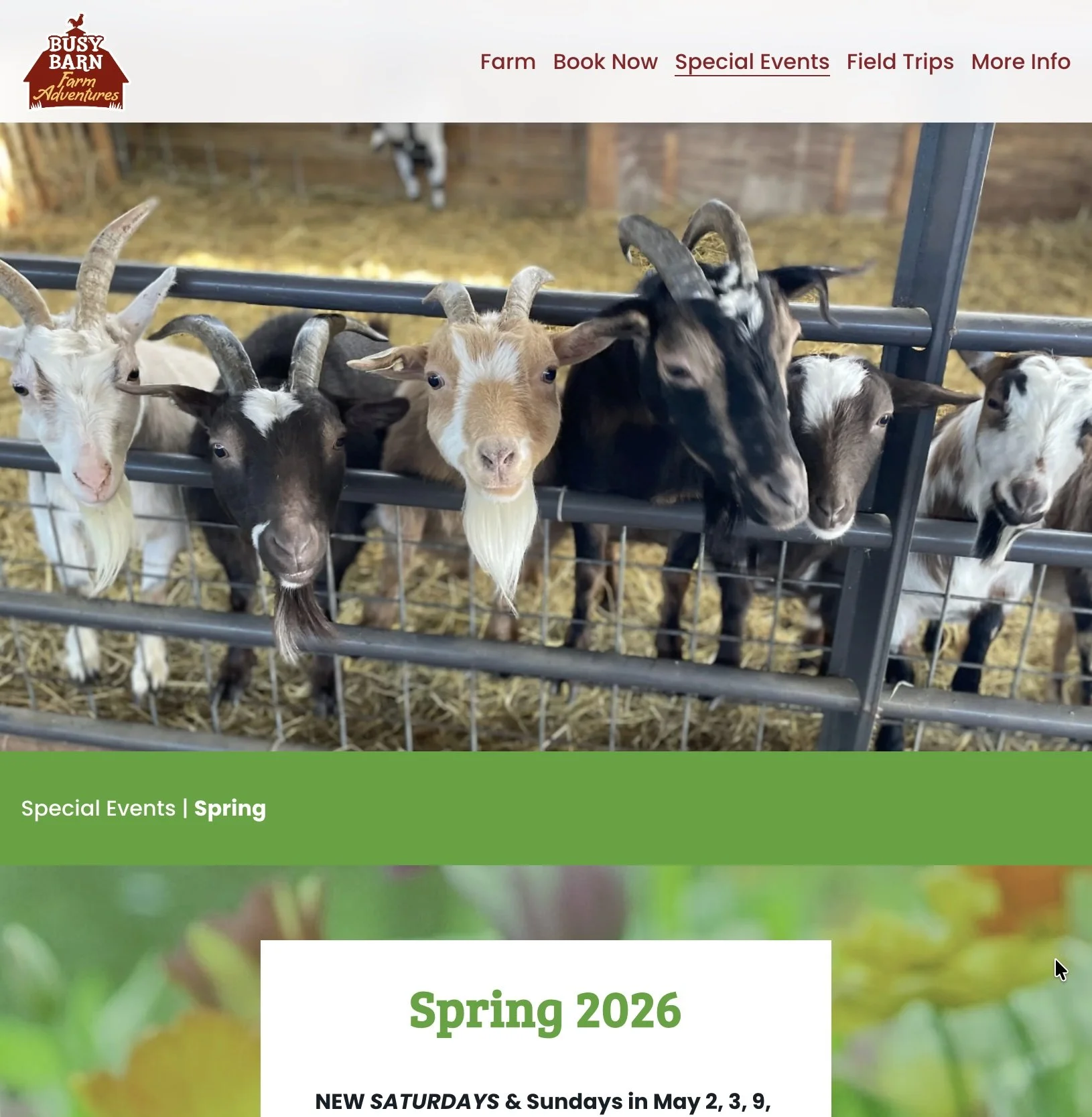
Spring Events
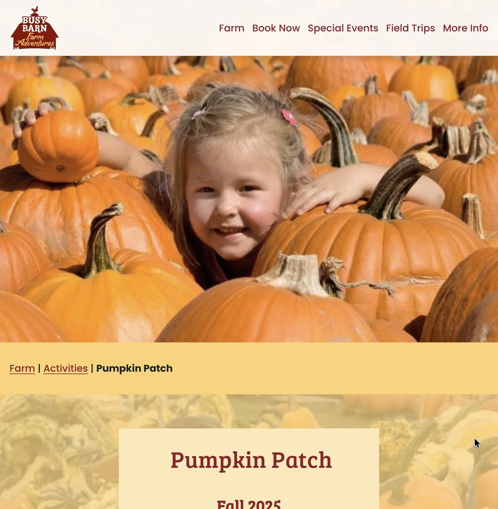
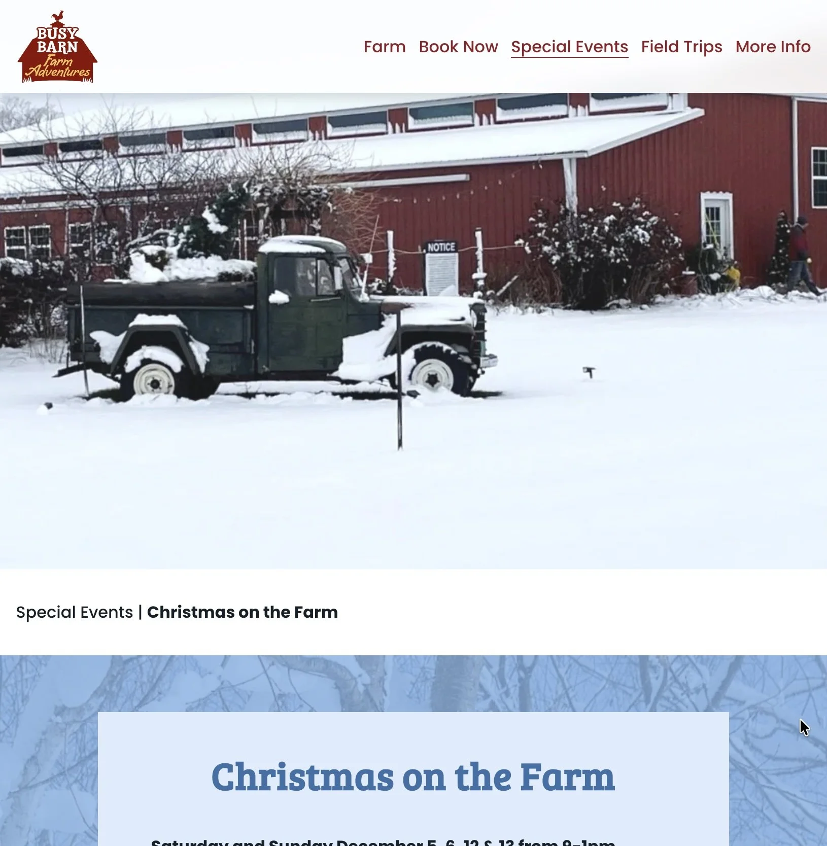
The event pages have a consistent layout, but with color and images each feels unique.
-
![]()
Pumpkin Event
-
![]()
Winter Event
-
![]()
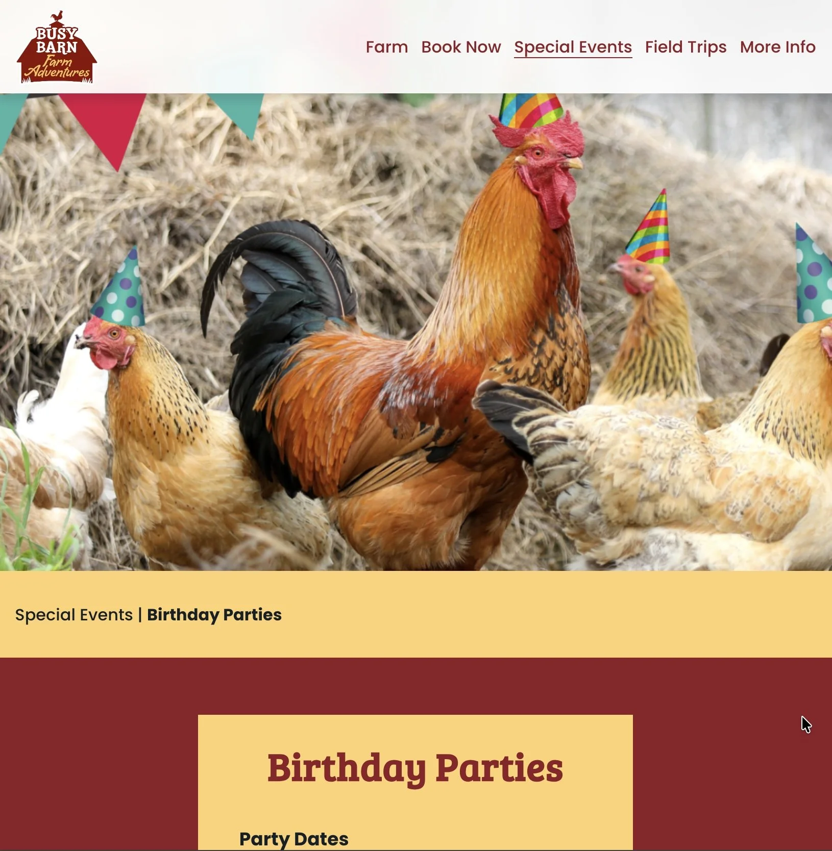
Birthday Events
Always fun to add a little humor and whimsy.
-
![]()
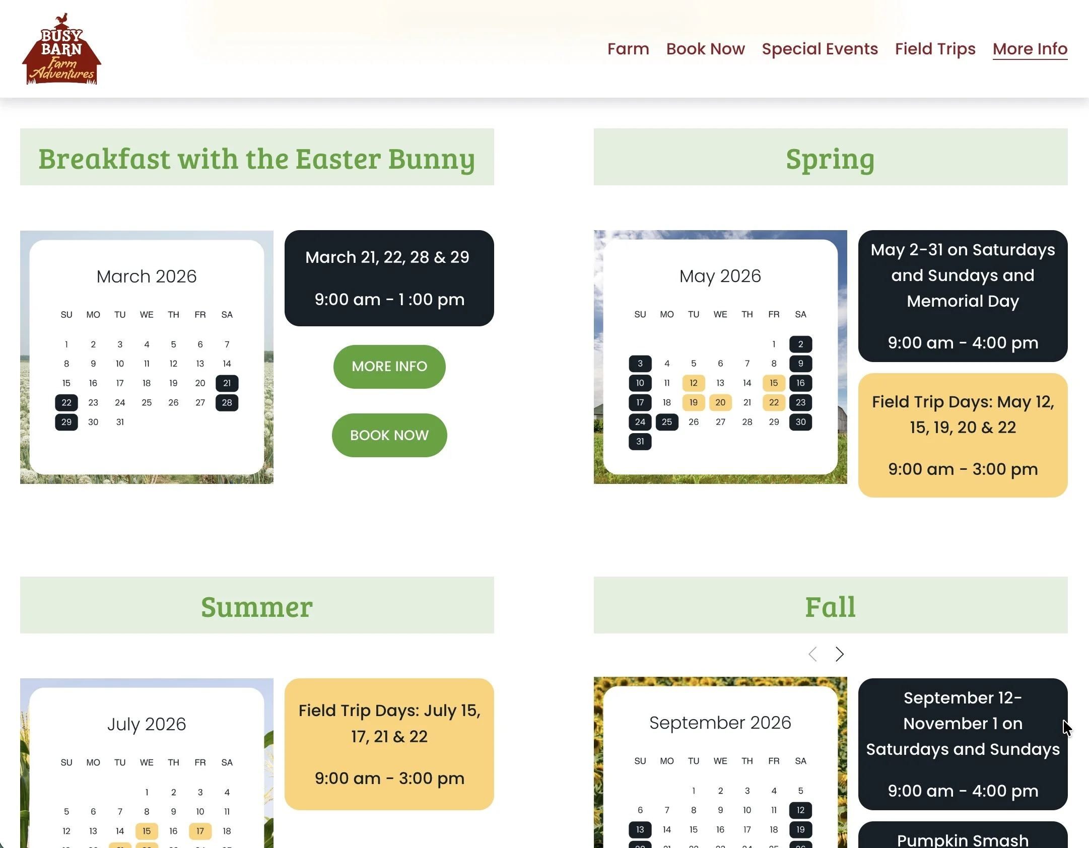
Calendar
I added calendar graphics to make the days open to the public clear and easy to see.
-
![]()
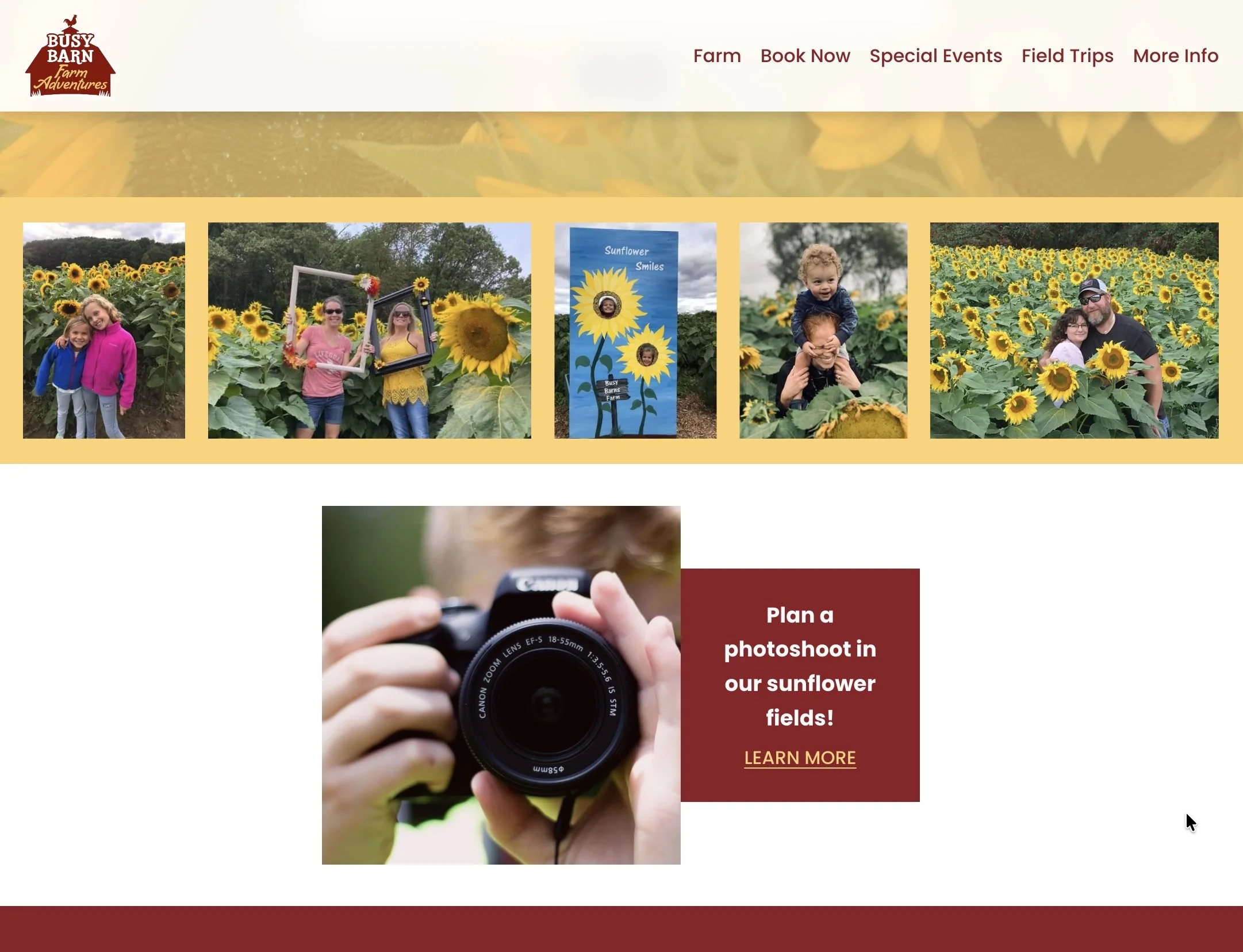
Eye Catching Elements
-
![]()
Original Design
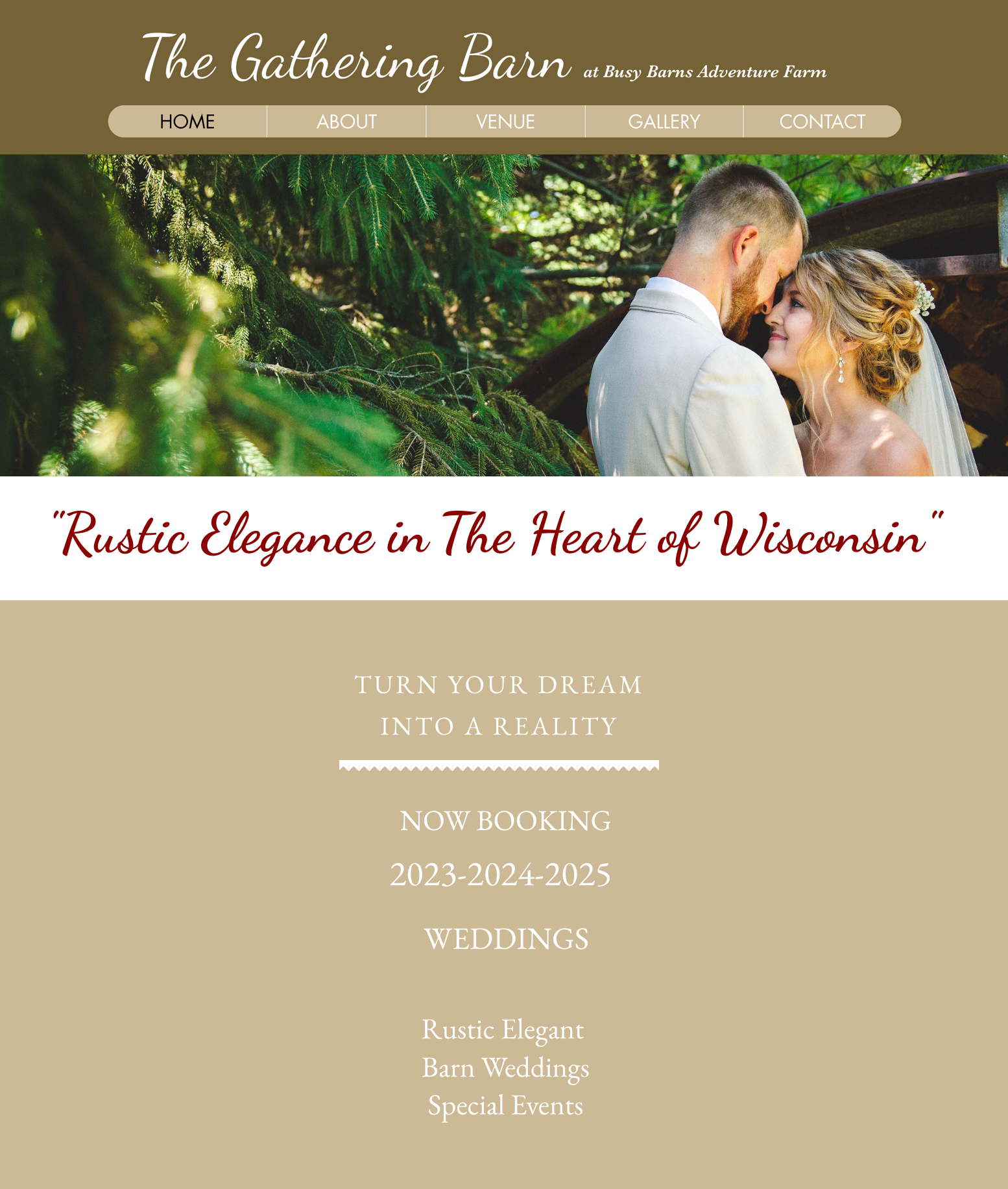
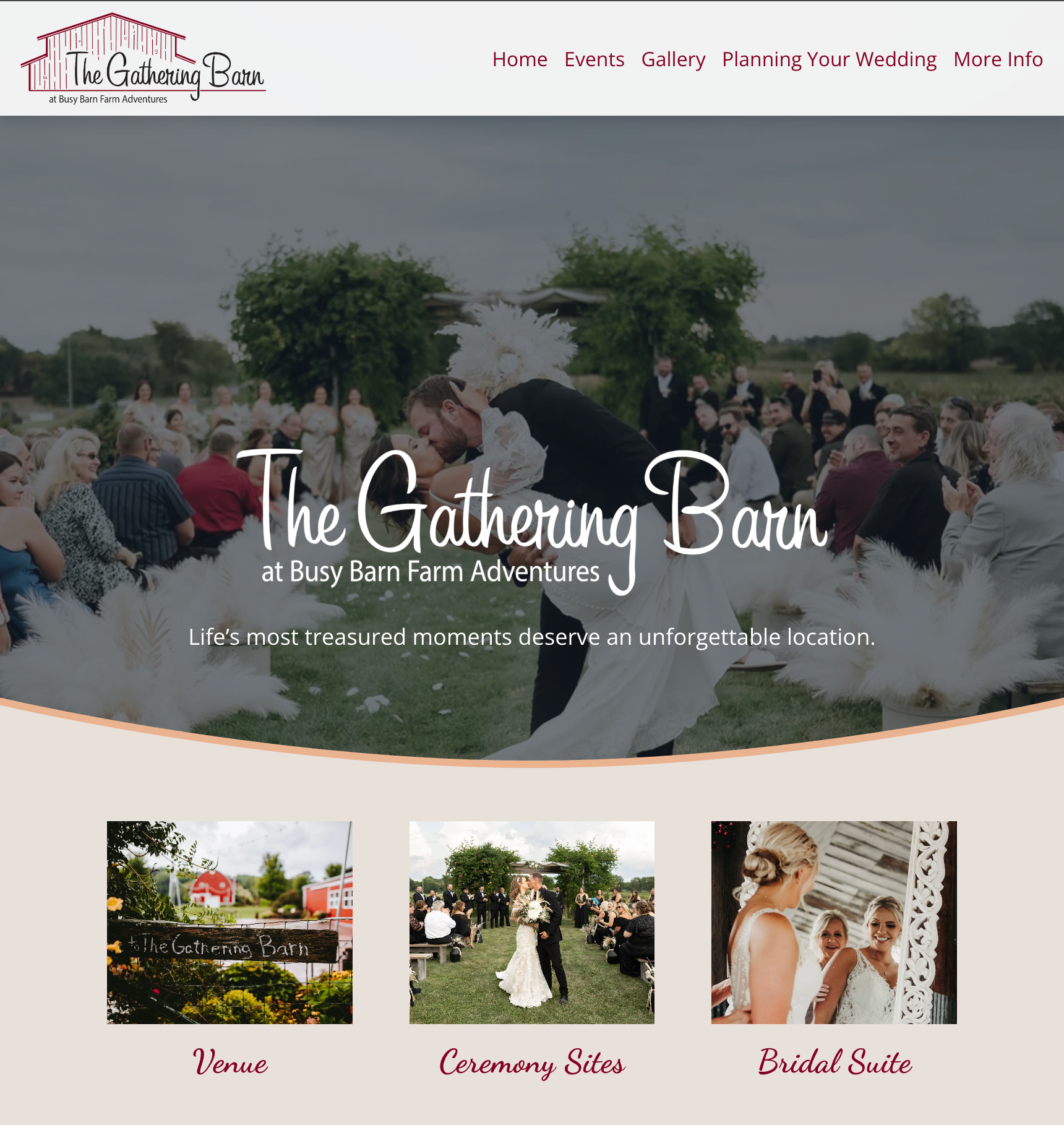
This site was updated to reflect a more elegant feel for the new owners.
-
![]()
New Design
To ease navigation, the home page mirrors the menu but with added images and descriptions for each section.